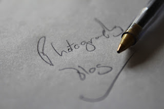
 This is a close up photograph that I have taken. I took it
of a pen with handwriting saying ‘Photography blog’ for an introduction to my
first project. My first project is of close up photography. I wrote this in
handwriting and using long strokes so to create a more personal image which
would involve the audience more. I had positioned this on an angle so that it
is that much more interesting and exciting. And I also positioned the pen on a
slightly more extreme angle so that it differs slightly. I like the lighting in
this photograph because it creates a very good shadow of the pen so that there
are different colours and shades involved. I like the detail in the photograph.
The main boy of the writing is in focus but some parts are more blurry and out
of focus. This helps to make the photograph more interesting and exciting. The
same goes for the pen.
This is an altered version of the original photograph. In
this version I have used the filter ‘lighting and shadows’. Where I altered where the
lighting enters from. In this image I used a program called ‘gimp’ which is a
similar version of Photoshop. I
positioned the light source in the upper left of the photograph so that there
is a greater shadow caused by the pen, and also that the shadow doesn't obscure
or block any of the letters. I like that there is a very strong area of bright
whites, and then a slow gradient back to the regular colours. This shadow and
lighting effects in ‘gimp’ are much more different to those in Photoshop as
there is a much softer gradient, opposed to the strong cut off point caused by
the Photoshop version. I like this effect because it looks far more interesting
and exciting rather than the regular lighting version.
_________________________________________________________________________________
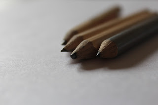
 This is a close up photograph of some pencils that I have
created. I used two different types of pencils in this so that there is a
difference in colour. It helps to make it more interesting as there is a
difference. I also like that the pencil has different levels of detail. This may
be because they are at different distances from the camera. I like the shadows
given off by pencils because it gives a sense of darkness on the white
background.
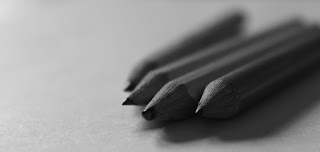
 This is the altered version for my cropped image. In this
version I have changed it to a black and white colour scheme so that it is more
exciting. It makes the shadows much darker which is an effective technique and
one which I like.
This is another altered version of my photographs. In this
image I have kept the cropped and black and white theme, and I have also
altered where the light enters the scene. I did this so that I could create a
lighter image on one side, and then a darker image where the shadows already
are (right). I like this because it gives the photograph a shine and a white,
modern appearance.


No comments:
Post a Comment