-->
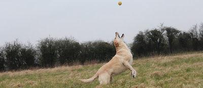
 This is a photograph of a dog that I have created (right). I decided to take the photo of a dog in a very
energy filled position. A dog like this is far more interesting that a regular
dog just sitting there looking at the camera. I like that the ball is captured
flying through the air also as it adds a whole new element. A burst of bright
yellows in front of the gloomy grey sky in the background. I did not really
like the framing of this photograph because it was a bit to far away and not
very involved. But then I had an idea that I should crop the image, so I
cropped it in Photoshop into more of a panoramic photograph. This involves the audience far more as they
are slightly closer and it is just a much better photograph. The cropped image (below) looks like a canted angle much more than the original photograph because it is more narrow. This is the technique which i was trying to achieve when taking the photograph because techniques such as the canted angle make photographs more effective.
____________________________________________________________________________________
-->
 This is the original photograph that I taken (right). It is of my
dog in a field. I like this photograph because it follows the Rule of Thirds.
And I also like the fact that the dog is focused upon and the background is
blurred so that the audience know which is the main area of focus. I like the
angle because it makes you feel more for the animal as you can see and
experience what it is. But I do feel that it is not bright enough. I may edit
this in Photoshop so that it looks more interesting.
This is the edited version of the photograph (below). In this is
have increased the Vibrance and Saturation. This gives the photograph more of
an interesting appearance because the dog looks very golden and colour full.
This version of the photograph will catch the eye of the audience far more that
the photograph. The setting for the
vibrance and saturation can be found below:
Vibrance: -9
Saturation: +35
___________________________________________________________________________________
-->
 This is the original image of a running dog through a field (right) The lighting on this photograph is
also good because the dog is clearly bright which shows the audience what the main
subject is. I enjoy the fun factor involved as the dog’s ears are airborne as
well as some specks of water in the air behind the dog. I focused on the dog so
to blur the majority of the background behind the dog so that maximum audience
attention can be focused on the dog.
This is the original image of a running dog through a field (right) The lighting on this photograph is
also good because the dog is clearly bright which shows the audience what the main
subject is. I enjoy the fun factor involved as the dog’s ears are airborne as
well as some specks of water in the air behind the dog. I focused on the dog so
to blur the majority of the background behind the dog so that maximum audience
attention can be focused on the dog.-->
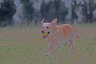
 This is an edited version of my photograph where I have used
the ‘shadows and highlights’ filter (left). The settings that I have chosen create a
more abstract photograph, which totally changes the perspective. I chose these
settings purposely so that I could keep the yellow colour in the ball, which
stands out very well in this filter. It seems although all of the colour that
is present in the mouth has been preserved resulting in a more interesting
photo. The setting that I have chosen can be found below:
Shadows: 55
Highlights: 100
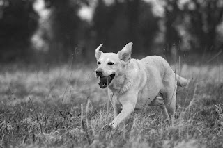
 This is a photograph that I edited using Photoshop (right) . In this
version of the photograph I have added the ‘black and white’ filter alteration.
I did this so that the photograph is a bit more interesting and effective. I
like this alteration as it shows the dog more easily as being the main subject
of the photograph. Using the black and white alter settings I managed to darken
the majority of the surrounding area
This is a photograph that I edited using Photoshop (right) . In this
version of the photograph I have added the ‘black and white’ filter alteration.
I did this so that the photograph is a bit more interesting and effective. I
like this alteration as it shows the dog more easily as being the main subject
of the photograph. Using the black and white alter settings I managed to darken
the majority of the surrounding areawhilst leaving the dog a bit brighter, thus making the dog stand out more. The setting for this filter can be found below:
Reds: 21
Yellows: -40
Greens: -35
Cyan: 140
Blues: 114
Magentas: 68
This is an edited version of an original photograph (left). In this
edited version I have edited the direction and the strength of the lighting
effects. I did this so that the photograph is far more interesting and
exciting. I completed this alteration by
positioning some shapes to affect the lighting strength and direction. You can
get a more clear indication of this process by the looking at the adjacent
screenshot of me completing this alteration.
___________________________________________________________________________________
-->
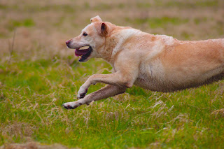
 This is the original photograph that I taken of a sprinting
dog (right). I like this photograph because it expresses energy. I love the framing in
this photograph because only the front half of the dog is being exposed. But
like another photographer, I believe that the lighting is a bit dull so I may
edit this in Photoshop so that it is more bright and vibrant.
 This is the edited Photoshop version of my photograph (left). In
this photograph like the other photograph I have edited the Vibrance and
Saturation. It gives the appearance of a very golden and crisp dog. The setting of this altered photograph can be
found below:
Vibrance: +100
Saturation:+35


No comments:
Post a Comment