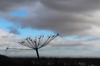
 This is a photograph of a plant in a local field. I like
this photograph because of the colours.
The angle, which I have taken the photograph in relation to the sun,
make the main image a sort of silhouette. In this photograph I tried to use the
basis of Rule of Thirds. I tried to position the photograph slightly off
centre. I like the angle of which the plant is at in relation to the horizon
and picture frame. I created a blurred background by using a close up setting
on the camera and macro setting on the lense so that maximum detail is put into
the plant, and as less as possible into the background. This helps it stand out
against the blue and grey/white background, which is the sky. The colour
differences of the horizon and the sky create an interest, as it is very bold.
I like that the plant is a similar colour to the horizon/land as it protrudes
out into the bright yet gloomy sky.
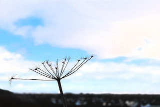
 This is the same photograph but with a filter over the top
of the original to make it more interesting. In this photograph I have used the
‘Film grain’ filter for this image because it creates a good effect. The
settings that I have used make the image, mainly the background more grainy and
make it look although it fades better on the edges. Creating a softer
photograph. By creating a much more
brighter background, there is a much greater difference between the lighter and
darker areas which I believe to make the photograph look more interesting. The
settings that I have used in this filter are below:
Grain: 2
Highlight Area: 20
 This is a filter, which I have added on top of the original
photograph. The filter that I am using is called ‘Glowing edges’. The original
settings that the ‘Glowing edges’ filter was on made the horizon show up as
well as the main plant. So I changed some
settings so that only the plant was visible. I like this photograph because
only the plant silhouette stands out, like the original but now with glowing
edges. This is a good effect because it is very interesting. This is because
the glowing plant stands out very easy against the blacked out background. This
piece looks very abstract, which is why I like it. It is much different to most
of my other photographs, which is why it is special, and stands out from the
crowd. The settings that I have used for this filter are below.
Edge width: 2
Edge brightness: 5
Smoothness: 0
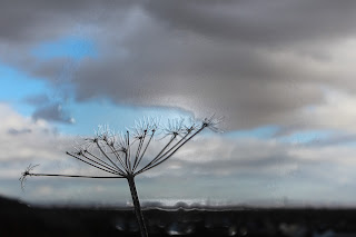
 This is a filtered photograph which I created using the
plastic wrap filter. I like the photograph with this filter on it because it
helps to create some form of 3- Dimension. It lifts up the image of the plant
and brings it forward slightly which helps to create some form of depth in the
photograph. I also like that there is more of a shine, as the light is more
visible. It seems to reflect off of the background, which is a good effect. I
carefully selected the correct settings for this particular photograph because
the correct balance between the settings is needed. In this I reduced the
detail so that things like the horizon and the clouds flow a bit more smoothly.
But not too much that the plant becomes distort and blurred. And I increased
the smoothness slightly so that this would work a bit more. I altered the
highlight strength so that things like the plant edges were a realistic
strength and size. The settings that I have used are found below:
Highlight Strength: 11
Detail: 12
Smoothness: 15
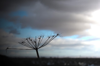
 In this photograph what I did is I changed the lighting
effects. I have moved the lighting from the left and right to primarily the
right and upper right. At first I positioned the light straight off to the
right, no angles etc. But then I decided to create some more depth and
interest. So I positioned a second lighting effect to the more upper right
looking down on the plant itself. You
can see this more clearly in the screenshot of this process. I really like this
effect as it lightens the one side of the photograph, but then also darkens and
shadows the over side. This is a good effect because it adds yet some more
complexity to the photograph and a more clear difference between the lights and
the darks. Another reason, which I like, this photograph is because it seems
that the plants is caught between the battle of light and dark, which is a very
appealing sense, and idea. The screenshot of myself in the process of editing
this photograph for this version can be found below.
I love these photographs because they are really interesting to look at. They are also very unique and you have edited them really well.
ReplyDelete