 This is the original photograph, which is of a dying flower (right).
I have chosen to include some filters on this photograph because it is almost
symmetrical. I thought it would be a good idea it could be more interesting
than a normal photograph of any other plant or flower. I like the lighting in
this photograph as you can see parts of the plant very easily but the shadows
are also very effective.
 In this photograph I am using the “Black and White’
effect. I like this effect because it
helps the photograph to look more rustic and it also helps to define the light
and the dark areas. This effect and the setting I have used have slightly
blurred and dissolved the background, which draws attention to the main plant/
flower. The settings that I have used can be found below.
Reds: -139
Yellows: -10
Greens: -35
Cyan: 244
Blues: -48
Magentas: -35
 In this photograph I have altered the ‘Brightness and
Contrast’ in Photoshop (right). I did this because I thought that the original was a
bit boring, so it needs the extra boost to become more effective. The main
reason that I like this is because the area around the plant has been darkened,
but slightly brightening the centre. This makes a good contrast in the
photograph and overall makes the photograph far more interesting and more
appealing to look at. It also attracts attention to the centre of the photograph. The settings, which I have used in this
photograph, can be found below.
Brightness: -64
Contrast: 100
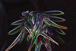
This is a filter, which I have added to a photograph(left). The
filter that I have used is called ‘Glowing Edges’. I like this effect because
it looks very abstract and fun. The lighter areas look very vibrant and
colourful. Whilst the darker areas look far more hazy and blurred but they
still look very effective as a photograph. I enjoy observing the diversity of
colours used in this filter. The main reason that I like this photograph over
some others is because it looks very symmetrical, and the fact that most of the
background has disappeared through the editing process just helps emphasise the
effect. The plant is the centre of attention and I believe that it increases
interest. The settings for this filter can be found below:
Edge width: 6
Edge brightness: 20
Smoothness: 15

I like the way you added glowing edges to the flower. It makes it look more interesting!
ReplyDelete