Ben this is an outstanding blog. You have made excellent use of a variety of Photoshop tools and filters. I particularly like the way you have made everyday ordinary objects look interesting and stimulating.
Mr Rees
Friday, 24 May 2013
Wednesday, 22 May 2013
My Photography Project- Evaluation
 For my third and final theme, I have decided to pick close-ups as my theme. I did this because I found some sort of success when taking some close-ups in my previous theme ‘The start of spring’. So I decided to make whole theme out of taking close up photography. For this close up project I mainly took photographs of household objects so that it is completely different to my other themes and so it has its own identity. For the majority of the photographs I used the close up setting on my camera and then also the macro setting on my 75-300mm lens, but often I left out the macro setting so that I could get physically closer to the object. In some I have positioned either myself or the objects so to make the photograph more interesting and effective. I made different objects enter the image at different angles so to create a more diverse and interesting photograph. Alike my other photographs, I have used a wide variety of filters and alterations. I have included them once again so to create a better and much more interesting photograph. I would want to improve many photographs as some may be boring or out of place etc. I focused on the main subject in the photograph by using great amounts of detail and focusing on the foreground, but blurring out the background etc. to make the photographs work I used a variety of different techniques. In some I used some rule of thirds, and in some other I have used lines to create the image. The image, which contains lines, is adjacent to this. Overall I am happy with the photographs that I have created because I have clearly used a variety of different techniques and distances etc. I believe that I could improve my photographs by using a more interesting object, as things such as keys are not very exciting. This may question the photos effectiveness. Some people thought that my photographs were good because of the different angles and filters and alteration that I have used. But some others that that I should attempt to try to improve the exciting factor of the images. Many of my photographs are very similar to some professional examples of close up photography. I have used some very similar alterations and detail levels etc.
Theme 2- Event- The Start of Spring
 For my second theme, my main subject was focused on
‘Nature’. I decided to use the main subject of Nature because spring was on the
horizon. So I decided to take advantage
of the newly found plants, and flowers and of course the brighter weather. I
decided to take the photographs that I have taken because it truly portrays
nature and spring. The plants and the bright berries worked very well as
photographs, which is why they are as effective as they are. To me the
photographs that I have used represent a new start, of a new life. The bright
and vibrant berries and plants are a sign of new life coming around yet again.
I tried to focus attention on the nature/ the start of spring theme in many
different ways and techniques. I think that the detail played a large role in creating
an emphasise on the theme and the themes main subjects. It helped me to create
large photograph so that more clear and eye catching attention could be
encouraged. In many photographs I mainly focussed on the main subject, creating
a blurred background, which creates more of a main focal point for the audience
to look at. It is a way of telling the audience that this is where we want you
to look. The light was also a valuable resource. It helped me to maximise
detail, and to show where I wanted the main focal point to be. The light helped
me to create a sort of contrast in some areas. It allowed for great bright and
vibrant areas, but also some gloomy shaded parts. A battle between the lights
and the darks. The composition allowed me to give the photographs their own
unique appearance and identity. In this project I have used the photography
technique of ‘Rule of Thirds’. This is when I position an object to the side of
the photograph or the top or bottom depending if the object or horizontal or
vertically positioned. I liked using different compositions in the form of
positioning the different at different heights and areas of the screen. You can
see this in this photograph where some plants are protruding to the near top to
the photograph, when some are near the bottom. I like this effect as it gives an
appearance of variation. I have also used some Extreme Close Ups so that the
main subject is clearly shown. In some I have used a mixture of Extreme close
ups and Rule of Thirds like in this example photograph. This gives a clear
definition of the subject but also in a more interesting manner as it is
positioned over to the right of the photograph frame. In many of my photographs
it has become effective because of the detail and the lighting. The lighting is
an extremely important factor in most of my photographs. It helps the focus and
in the example photograph it brightens up the whole image giving some shine and
glow. I have also added some filters to some photographs. I have used filters
like glowing edges and I have altered the saturation on some photographs so
that they stand out more. I am extremely pleased with the photographs that I
have taken and also the photographs that I have altered using the cropping
tool, Saturation, Brightness, and all round filters. I do feel that some
photographs could be improved just by making them slightly more interesting and
more things going on the image. Or maybe some could do with a boost in the
detail so that they are not as blurry as they are at the moment. I believe that
my favourite photograph is one image on the right. I love this Image and it is
an altered version of a previously taken photograph. From the original I
altered the saturation to make to whole image more vibrant and glowing. It
helps to create an interesting and relaxing atmosphere and also very bright and
eye catching. Also because the background is completely blurred out making a
softer image resulting in maximum attention towards the main subjects. I
believe that other people thought that my images appeared to look very crisp
and professional looking. They say this because of the bright and vibrant
appearance and that there is plenty to look at in many of my images. But others
thought that some of my images might have been a bit too saturated. This is
something that I have noticed in one or two of my images but I believe that the
balance is acceptable.
For my second theme, my main subject was focused on
‘Nature’. I decided to use the main subject of Nature because spring was on the
horizon. So I decided to take advantage
of the newly found plants, and flowers and of course the brighter weather. I
decided to take the photographs that I have taken because it truly portrays
nature and spring. The plants and the bright berries worked very well as
photographs, which is why they are as effective as they are. To me the
photographs that I have used represent a new start, of a new life. The bright
and vibrant berries and plants are a sign of new life coming around yet again.
I tried to focus attention on the nature/ the start of spring theme in many
different ways and techniques. I think that the detail played a large role in creating
an emphasise on the theme and the themes main subjects. It helped me to create
large photograph so that more clear and eye catching attention could be
encouraged. In many photographs I mainly focussed on the main subject, creating
a blurred background, which creates more of a main focal point for the audience
to look at. It is a way of telling the audience that this is where we want you
to look. The light was also a valuable resource. It helped me to maximise
detail, and to show where I wanted the main focal point to be. The light helped
me to create a sort of contrast in some areas. It allowed for great bright and
vibrant areas, but also some gloomy shaded parts. A battle between the lights
and the darks. The composition allowed me to give the photographs their own
unique appearance and identity. In this project I have used the photography
technique of ‘Rule of Thirds’. This is when I position an object to the side of
the photograph or the top or bottom depending if the object or horizontal or
vertically positioned. I liked using different compositions in the form of
positioning the different at different heights and areas of the screen. You can
see this in this photograph where some plants are protruding to the near top to
the photograph, when some are near the bottom. I like this effect as it gives an
appearance of variation. I have also used some Extreme Close Ups so that the
main subject is clearly shown. In some I have used a mixture of Extreme close
ups and Rule of Thirds like in this example photograph. This gives a clear
definition of the subject but also in a more interesting manner as it is
positioned over to the right of the photograph frame. In many of my photographs
it has become effective because of the detail and the lighting. The lighting is
an extremely important factor in most of my photographs. It helps the focus and
in the example photograph it brightens up the whole image giving some shine and
glow. I have also added some filters to some photographs. I have used filters
like glowing edges and I have altered the saturation on some photographs so
that they stand out more. I am extremely pleased with the photographs that I
have taken and also the photographs that I have altered using the cropping
tool, Saturation, Brightness, and all round filters. I do feel that some
photographs could be improved just by making them slightly more interesting and
more things going on the image. Or maybe some could do with a boost in the
detail so that they are not as blurry as they are at the moment. I believe that
my favourite photograph is one image on the right. I love this Image and it is
an altered version of a previously taken photograph. From the original I
altered the saturation to make to whole image more vibrant and glowing. It
helps to create an interesting and relaxing atmosphere and also very bright and
eye catching. Also because the background is completely blurred out making a
softer image resulting in maximum attention towards the main subjects. I
believe that other people thought that my images appeared to look very crisp
and professional looking. They say this because of the bright and vibrant
appearance and that there is plenty to look at in many of my images. But others
thought that some of my images might have been a bit too saturated. This is
something that I have noticed in one or two of my images but I believe that the
balance is acceptable.
Theme 3- Portrait- Canine
 For my fist them I have chosen to pick Portrait as my theme. Within the portrait theme, I have chose to take photographs of the canine variety. I decided to use canine as my theme as I own several dogs, meaning it is easy to take photographs. I mainly took photographs when on a walk as it involved alto of running for the dogs. This allowed me to take some very good action shots when running and jumping is taking place. Of course the main subject of my photographs are dogs. The running, jumping and energy filled animals allowed me to create a lot of exciting and interesting photographs. Something, which greatly aided me when taking these photographs, is the shutter speed of my cameras. Since I have 3.7 photographs per second speed I could take the image that I wanted at the correct moment. I took these photographs so that I could capture my dogs in a very good photograph, so that the moment is captured. I have used several different methods to allow attention to be focused on the main subject. A good composition is a good way of this is if you position the subject other than the centre then interest grows and the photograph is better. Like in the example photograph just to the side, I have placed the dog in the bottom left section of the photograph so that the attention draws towards it. I have used Rule of Thirds in this section so that the attention draws towards the dog, and also there is plenty of background in the photograph. Also having the dog quite large instantly let’s the audience know which area of the photograph is the main subject of focus. The lighting was a good contribution towards the final photograph as it allowed the detail to take a hold in the image. The lighting created shadows in some areas, which helps to create a good variation between the lights and the darks in the images. And the bold shadows create a more 3-dimensional appearance and interesting image. The focus of the camera allowed me to take photographs on moving objects. An example of this is the photograph of my dog shaking with water flying around the image. I could capture the ears flapping around the photograph, and also the water droplets flying off of the dog.
Overall I believe that my photography project has been
a great success because I have used many different themes, techniques and
alterations. This project has helped me learn an exceedingly large amount about
photography and about how it works.
Theme 1- Concept- Close Ups
Some good photographs- Close Ups and Alterations
 This is a close up photograph that I have taken. I took it
of a pen with handwriting saying ‘Photography blog’ for an introduction to my
first project. My first project is of close up photography. I wrote this in
handwriting and using long strokes so to create a more personal image which
would involve the audience more. I had positioned this on an angle so that it
is that much more interesting and exciting. And I also positioned the pen on a
slightly more extreme angle so that it differs slightly. I like the lighting in
this photograph because it creates a very good shadow of the pen so that there
are different colours and shades involved. I like the detail in the photograph.
The main boy of the writing is in focus but some parts are more blurry and out
of focus. This helps to make the photograph more interesting and exciting. The
same goes for the pen.
This is a close up photograph that I have taken. I took it
of a pen with handwriting saying ‘Photography blog’ for an introduction to my
first project. My first project is of close up photography. I wrote this in
handwriting and using long strokes so to create a more personal image which
would involve the audience more. I had positioned this on an angle so that it
is that much more interesting and exciting. And I also positioned the pen on a
slightly more extreme angle so that it differs slightly. I like the lighting in
this photograph because it creates a very good shadow of the pen so that there
are different colours and shades involved. I like the detail in the photograph.
The main boy of the writing is in focus but some parts are more blurry and out
of focus. This helps to make the photograph more interesting and exciting. The
same goes for the pen.

 This is a close up photograph of some pencils that I have
created. I used two different types of pencils in this so that there is a
difference in colour. It helps to make it more interesting as there is a
difference. I also like that the pencil has different levels of detail. This may
be because they are at different distances from the camera. I like the shadows
given off by pencils because it gives a sense of darkness on the white
background.
This is a close up photograph of some pencils that I have
created. I used two different types of pencils in this so that there is a
difference in colour. It helps to make it more interesting as there is a
difference. I also like that the pencil has different levels of detail. This may
be because they are at different distances from the camera. I like the shadows
given off by pencils because it gives a sense of darkness on the white
background.

This is the altered version of my original photograph. In
this version I have cropped it slightly so that it looks more of a panoramic
photograph. This may help to make the photograph more effective as it is
different to many of my other photos.
 This is the altered version for my cropped image. In this
version I have changed it to a black and white colour scheme so that it is more
exciting. It makes the shadows much darker which is an effective technique and
one which I like.
This is the altered version for my cropped image. In this
version I have changed it to a black and white colour scheme so that it is more
exciting. It makes the shadows much darker which is an effective technique and
one which I like.

 This is a close up photograph that I have taken. I took it
of a pen with handwriting saying ‘Photography blog’ for an introduction to my
first project. My first project is of close up photography. I wrote this in
handwriting and using long strokes so to create a more personal image which
would involve the audience more. I had positioned this on an angle so that it
is that much more interesting and exciting. And I also positioned the pen on a
slightly more extreme angle so that it differs slightly. I like the lighting in
this photograph because it creates a very good shadow of the pen so that there
are different colours and shades involved. I like the detail in the photograph.
The main boy of the writing is in focus but some parts are more blurry and out
of focus. This helps to make the photograph more interesting and exciting. The
same goes for the pen.
This is a close up photograph that I have taken. I took it
of a pen with handwriting saying ‘Photography blog’ for an introduction to my
first project. My first project is of close up photography. I wrote this in
handwriting and using long strokes so to create a more personal image which
would involve the audience more. I had positioned this on an angle so that it
is that much more interesting and exciting. And I also positioned the pen on a
slightly more extreme angle so that it differs slightly. I like the lighting in
this photograph because it creates a very good shadow of the pen so that there
are different colours and shades involved. I like the detail in the photograph.
The main boy of the writing is in focus but some parts are more blurry and out
of focus. This helps to make the photograph more interesting and exciting. The
same goes for the pen.
This is an altered version of the original photograph. In
this version I have used the filter ‘lighting and shadows’. Where I altered where the
lighting enters from. In this image I used a program called ‘gimp’ which is a
similar version of Photoshop. I
positioned the light source in the upper left of the photograph so that there
is a greater shadow caused by the pen, and also that the shadow doesn't obscure
or block any of the letters. I like that there is a very strong area of bright
whites, and then a slow gradient back to the regular colours. This shadow and
lighting effects in ‘gimp’ are much more different to those in Photoshop as
there is a much softer gradient, opposed to the strong cut off point caused by
the Photoshop version. I like this effect because it looks far more interesting
and exciting rather than the regular lighting version.

_________________________________________________________________________________
 This is a close up photograph of some pencils that I have
created. I used two different types of pencils in this so that there is a
difference in colour. It helps to make it more interesting as there is a
difference. I also like that the pencil has different levels of detail. This may
be because they are at different distances from the camera. I like the shadows
given off by pencils because it gives a sense of darkness on the white
background.
This is a close up photograph of some pencils that I have
created. I used two different types of pencils in this so that there is a
difference in colour. It helps to make it more interesting as there is a
difference. I also like that the pencil has different levels of detail. This may
be because they are at different distances from the camera. I like the shadows
given off by pencils because it gives a sense of darkness on the white
background.
 This is the altered version for my cropped image. In this
version I have changed it to a black and white colour scheme so that it is more
exciting. It makes the shadows much darker which is an effective technique and
one which I like.
This is the altered version for my cropped image. In this
version I have changed it to a black and white colour scheme so that it is more
exciting. It makes the shadows much darker which is an effective technique and
one which I like. 
This is another altered version of my photographs. In this
image I have kept the cropped and black and white theme, and I have also
altered where the light enters the scene. I did this so that I could create a
lighter image on one side, and then a darker image where the shadows already
are (right). I like this because it gives the photograph a shine and a white,
modern appearance.
Theme 1- Concept- Close Ups
Some good Photos- Close Ups and Alterations
 This is a close up photograph that I have created. To create
this I used the ‘close up’ setting on my camera. This is so that I could get a
lot of detail in the photograph. I purposely set part of the keys to be out of
focus so that it is not all the same. I wanted a difference in the photograph.
Personally I believe that this photograph is very dull mainly because of the
boring colours. So I may alter this and increase its saturation to make it a
bit warmer and colourful.
This is a close up photograph that I have created. To create
this I used the ‘close up’ setting on my camera. This is so that I could get a
lot of detail in the photograph. I purposely set part of the keys to be out of
focus so that it is not all the same. I wanted a difference in the photograph.
Personally I believe that this photograph is very dull mainly because of the
boring colours. So I may alter this and increase its saturation to make it a
bit warmer and colourful.

This is the edited version of my original photograph where as I previously stated, I have increased the saturation. But I only increased it slightly so that the bronze key would stand out more and give the photograph a sense a colour. The reason I did not increase it more is so that I did not overpower the image with a strong bronze/ gold like colour.
_________________________________________________________________________________
 This is a close up photograph of some pens that I created. In
this I tried to use the lines of the pens to my advantage to create a very
effective photograph. To get the detail required in this photograph I used the ‘close
up’ setting on my camera. I like that not everything in this photograph is in
pure focus. For example, not all of the pens are in focus, mainly the nib is. The
main area which I like is the writing as it helps to create a diverse atmosphere
in the image, unlike any other that I have created. I like the colours used in
this photograph. Most of them are dull but then you notice the shiny gold like
colour on the end of the pen. This adds some colour into an otherwise boring
image.
This is a close up photograph of some pens that I created. In
this I tried to use the lines of the pens to my advantage to create a very
effective photograph. To get the detail required in this photograph I used the ‘close
up’ setting on my camera. I like that not everything in this photograph is in
pure focus. For example, not all of the pens are in focus, mainly the nib is. The
main area which I like is the writing as it helps to create a diverse atmosphere
in the image, unlike any other that I have created. I like the colours used in
this photograph. Most of them are dull but then you notice the shiny gold like
colour on the end of the pen. This adds some colour into an otherwise boring
image.
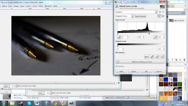 This is the altered version of my original photograph, which I altered using 'Gimp' (left). In this
photograph I have adjusted the colour levels so that it is more effective. You can
see the settings that I have used in the adjacent screenshot (below). I like this
affect because it darkens most of the areas, but still allows the golden nib to
shine and to create the centre of attention.
This is the altered version of my original photograph, which I altered using 'Gimp' (left). In this
photograph I have adjusted the colour levels so that it is more effective. You can
see the settings that I have used in the adjacent screenshot (below). I like this
affect because it darkens most of the areas, but still allows the golden nib to
shine and to create the centre of attention.
_________________________________________________________________________________
 This is a close up photograph that I have created. To create
this I used the ‘close up’ setting on my camera. This is so that I could get a
lot of detail in the photograph. I purposely set part of the keys to be out of
focus so that it is not all the same. I wanted a difference in the photograph.
Personally I believe that this photograph is very dull mainly because of the
boring colours. So I may alter this and increase its saturation to make it a
bit warmer and colourful.
This is a close up photograph that I have created. To create
this I used the ‘close up’ setting on my camera. This is so that I could get a
lot of detail in the photograph. I purposely set part of the keys to be out of
focus so that it is not all the same. I wanted a difference in the photograph.
Personally I believe that this photograph is very dull mainly because of the
boring colours. So I may alter this and increase its saturation to make it a
bit warmer and colourful.
This is the edited version of my original photograph where as I previously stated, I have increased the saturation. But I only increased it slightly so that the bronze key would stand out more and give the photograph a sense a colour. The reason I did not increase it more is so that I did not overpower the image with a strong bronze/ gold like colour.
_________________________________________________________________________________
 This is a close up photograph of some pens that I created. In
this I tried to use the lines of the pens to my advantage to create a very
effective photograph. To get the detail required in this photograph I used the ‘close
up’ setting on my camera. I like that not everything in this photograph is in
pure focus. For example, not all of the pens are in focus, mainly the nib is. The
main area which I like is the writing as it helps to create a diverse atmosphere
in the image, unlike any other that I have created. I like the colours used in
this photograph. Most of them are dull but then you notice the shiny gold like
colour on the end of the pen. This adds some colour into an otherwise boring
image.
This is a close up photograph of some pens that I created. In
this I tried to use the lines of the pens to my advantage to create a very
effective photograph. To get the detail required in this photograph I used the ‘close
up’ setting on my camera. I like that not everything in this photograph is in
pure focus. For example, not all of the pens are in focus, mainly the nib is. The
main area which I like is the writing as it helps to create a diverse atmosphere
in the image, unlike any other that I have created. I like the colours used in
this photograph. Most of them are dull but then you notice the shiny gold like
colour on the end of the pen. This adds some colour into an otherwise boring
image.
 This is the altered version of my original photograph, which I altered using 'Gimp' (left). In this
photograph I have adjusted the colour levels so that it is more effective. You can
see the settings that I have used in the adjacent screenshot (below). I like this
affect because it darkens most of the areas, but still allows the golden nib to
shine and to create the centre of attention.
This is the altered version of my original photograph, which I altered using 'Gimp' (left). In this
photograph I have adjusted the colour levels so that it is more effective. You can
see the settings that I have used in the adjacent screenshot (below). I like this
affect because it darkens most of the areas, but still allows the golden nib to
shine and to create the centre of attention._________________________________________________________________________________
Theme 2- Event- The start of spring
Rule of Thirds

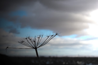
This is a photo that I have taken using the photo technique
‘Rule of Thirds’ (right). It is a photograph of a plant in a field. When taking the
photograph, I tried to position the main subject that is a plant in the bottom
right section/corner. I have chose to have the main subject in this position
because it looks far more interesting than a centralized photo. I like this
photograph because of the ‘Rule of Thirds’ technique that I used. But I also
like the lighting in the photograph as you can easily see what is going on in
large detail. I love the type of background which I have as it draws attention
to the plant. I created this totally blurred background by using a close up
setting on my camera, and then the ‘Macro’ setting on my lens. This helped me
to give maximum detail into the plant, and less detail as possible in the
background. This photo has been slightly cropped (below) so that the ‘Rule of Thirds’
is emphasised that much more.I have added in the 'Rule of Thirds' lines so that it is more visible.

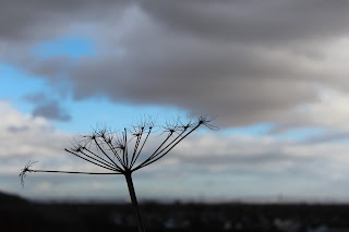
This is a photo that I have taken using the photography
technique of ‘Rule of Thirds’ (below). It is a photograph of a plant in a local field. I positioned the plant in the bottom right corner so that it allows the rest of the image to be open and free. This creates an empty like image apart from the soft gradients in the background. i created these gradients by using the close up setting on my camera, and then also using the macro setting on my lens so that maximum attention to detail could be achieved. This also helps to focus on the main visual image of the photograph and to tell the audience this too.

Theme 2- Event- The start of spring
Filters and Alterations
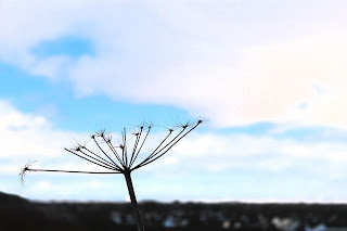
 This is a photograph of a plant in a local field. I like
this photograph because of the colours.
The angle, which I have taken the photograph in relation to the sun,
make the main image a sort of silhouette. In this photograph I tried to use the
basis of Rule of Thirds. I tried to position the photograph slightly off
centre. I like the angle of which the plant is at in relation to the horizon
and picture frame. I created a blurred background by using a close up setting
on the camera and macro setting on the lense so that maximum detail is put into
the plant, and as less as possible into the background. This helps it stand out
against the blue and grey/white background, which is the sky. The colour
differences of the horizon and the sky create an interest, as it is very bold.
I like that the plant is a similar colour to the horizon/land as it protrudes
out into the bright yet gloomy sky.
This is a photograph of a plant in a local field. I like
this photograph because of the colours.
The angle, which I have taken the photograph in relation to the sun,
make the main image a sort of silhouette. In this photograph I tried to use the
basis of Rule of Thirds. I tried to position the photograph slightly off
centre. I like the angle of which the plant is at in relation to the horizon
and picture frame. I created a blurred background by using a close up setting
on the camera and macro setting on the lense so that maximum detail is put into
the plant, and as less as possible into the background. This helps it stand out
against the blue and grey/white background, which is the sky. The colour
differences of the horizon and the sky create an interest, as it is very bold.
I like that the plant is a similar colour to the horizon/land as it protrudes
out into the bright yet gloomy sky.
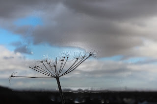
 This is the same photograph but with a filter over the top
of the original to make it more interesting. In this photograph I have used the
‘Film grain’ filter for this image because it creates a good effect. The
settings that I have used make the image, mainly the background more grainy and
make it look although it fades better on the edges. Creating a softer
photograph. By creating a much more
brighter background, there is a much greater difference between the lighter and
darker areas which I believe to make the photograph look more interesting. The
settings that I have used in this filter are below:
This is the same photograph but with a filter over the top
of the original to make it more interesting. In this photograph I have used the
‘Film grain’ filter for this image because it creates a good effect. The
settings that I have used make the image, mainly the background more grainy and
make it look although it fades better on the edges. Creating a softer
photograph. By creating a much more
brighter background, there is a much greater difference between the lighter and
darker areas which I believe to make the photograph look more interesting. The
settings that I have used in this filter are below:
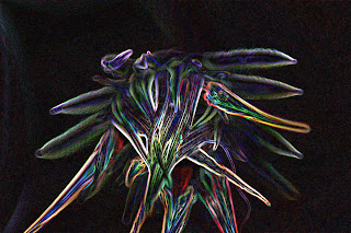
 This is a filter, which I have added on top of the original
photograph. The filter that I am using is called ‘Glowing edges’. The original
settings that the ‘Glowing edges’ filter was on made the horizon show up as
well as the main plant. So I changed some
settings so that only the plant was visible. I like this photograph because
only the plant silhouette stands out, like the original but now with glowing
edges. This is a good effect because it is very interesting. This is because
the glowing plant stands out very easy against the blacked out background. This
piece looks very abstract, which is why I like it. It is much different to most
of my other photographs, which is why it is special, and stands out from the
crowd. The settings that I have used for this filter are below.
This is a filter, which I have added on top of the original
photograph. The filter that I am using is called ‘Glowing edges’. The original
settings that the ‘Glowing edges’ filter was on made the horizon show up as
well as the main plant. So I changed some
settings so that only the plant was visible. I like this photograph because
only the plant silhouette stands out, like the original but now with glowing
edges. This is a good effect because it is very interesting. This is because
the glowing plant stands out very easy against the blacked out background. This
piece looks very abstract, which is why I like it. It is much different to most
of my other photographs, which is why it is special, and stands out from the
crowd. The settings that I have used for this filter are below.
 This is a filtered photograph which I created using the
plastic wrap filter. I like the photograph with this filter on it because it
helps to create some form of 3- Dimension. It lifts up the image of the plant
and brings it forward slightly which helps to create some form of depth in the
photograph. I also like that there is more of a shine, as the light is more
visible. It seems to reflect off of the background, which is a good effect. I
carefully selected the correct settings for this particular photograph because
the correct balance between the settings is needed. In this I reduced the
detail so that things like the horizon and the clouds flow a bit more smoothly.
But not too much that the plant becomes distort and blurred. And I increased
the smoothness slightly so that this would work a bit more. I altered the
highlight strength so that things like the plant edges were a realistic
strength and size. The settings that I have used are found below:
This is a filtered photograph which I created using the
plastic wrap filter. I like the photograph with this filter on it because it
helps to create some form of 3- Dimension. It lifts up the image of the plant
and brings it forward slightly which helps to create some form of depth in the
photograph. I also like that there is more of a shine, as the light is more
visible. It seems to reflect off of the background, which is a good effect. I
carefully selected the correct settings for this particular photograph because
the correct balance between the settings is needed. In this I reduced the
detail so that things like the horizon and the clouds flow a bit more smoothly.
But not too much that the plant becomes distort and blurred. And I increased
the smoothness slightly so that this would work a bit more. I altered the
highlight strength so that things like the plant edges were a realistic
strength and size. The settings that I have used are found below:
 In this photograph what I did is I changed the lighting
effects. I have moved the lighting from the left and right to primarily the
right and upper right. At first I positioned the light straight off to the
right, no angles etc. But then I decided to create some more depth and
interest. So I positioned a second lighting effect to the more upper right
looking down on the plant itself. You
can see this more clearly in the screenshot of this process. I really like this
effect as it lightens the one side of the photograph, but then also darkens and
shadows the over side. This is a good effect because it adds yet some more
complexity to the photograph and a more clear difference between the lights and
the darks. Another reason, which I like, this photograph is because it seems
that the plants is caught between the battle of light and dark, which is a very
appealing sense, and idea. The screenshot of myself in the process of editing
this photograph for this version can be found below.
In this photograph what I did is I changed the lighting
effects. I have moved the lighting from the left and right to primarily the
right and upper right. At first I positioned the light straight off to the
right, no angles etc. But then I decided to create some more depth and
interest. So I positioned a second lighting effect to the more upper right
looking down on the plant itself. You
can see this more clearly in the screenshot of this process. I really like this
effect as it lightens the one side of the photograph, but then also darkens and
shadows the over side. This is a good effect because it adds yet some more
complexity to the photograph and a more clear difference between the lights and
the darks. Another reason, which I like, this photograph is because it seems
that the plants is caught between the battle of light and dark, which is a very
appealing sense, and idea. The screenshot of myself in the process of editing
this photograph for this version can be found below.

 This is a photograph of a plant in a local field. I like
this photograph because of the colours.
The angle, which I have taken the photograph in relation to the sun,
make the main image a sort of silhouette. In this photograph I tried to use the
basis of Rule of Thirds. I tried to position the photograph slightly off
centre. I like the angle of which the plant is at in relation to the horizon
and picture frame. I created a blurred background by using a close up setting
on the camera and macro setting on the lense so that maximum detail is put into
the plant, and as less as possible into the background. This helps it stand out
against the blue and grey/white background, which is the sky. The colour
differences of the horizon and the sky create an interest, as it is very bold.
I like that the plant is a similar colour to the horizon/land as it protrudes
out into the bright yet gloomy sky.
This is a photograph of a plant in a local field. I like
this photograph because of the colours.
The angle, which I have taken the photograph in relation to the sun,
make the main image a sort of silhouette. In this photograph I tried to use the
basis of Rule of Thirds. I tried to position the photograph slightly off
centre. I like the angle of which the plant is at in relation to the horizon
and picture frame. I created a blurred background by using a close up setting
on the camera and macro setting on the lense so that maximum detail is put into
the plant, and as less as possible into the background. This helps it stand out
against the blue and grey/white background, which is the sky. The colour
differences of the horizon and the sky create an interest, as it is very bold.
I like that the plant is a similar colour to the horizon/land as it protrudes
out into the bright yet gloomy sky. This is the same photograph but with a filter over the top
of the original to make it more interesting. In this photograph I have used the
‘Film grain’ filter for this image because it creates a good effect. The
settings that I have used make the image, mainly the background more grainy and
make it look although it fades better on the edges. Creating a softer
photograph. By creating a much more
brighter background, there is a much greater difference between the lighter and
darker areas which I believe to make the photograph look more interesting. The
settings that I have used in this filter are below:
This is the same photograph but with a filter over the top
of the original to make it more interesting. In this photograph I have used the
‘Film grain’ filter for this image because it creates a good effect. The
settings that I have used make the image, mainly the background more grainy and
make it look although it fades better on the edges. Creating a softer
photograph. By creating a much more
brighter background, there is a much greater difference between the lighter and
darker areas which I believe to make the photograph look more interesting. The
settings that I have used in this filter are below:
Grain: 2
Highlight Area: 20
 This is a filter, which I have added on top of the original
photograph. The filter that I am using is called ‘Glowing edges’. The original
settings that the ‘Glowing edges’ filter was on made the horizon show up as
well as the main plant. So I changed some
settings so that only the plant was visible. I like this photograph because
only the plant silhouette stands out, like the original but now with glowing
edges. This is a good effect because it is very interesting. This is because
the glowing plant stands out very easy against the blacked out background. This
piece looks very abstract, which is why I like it. It is much different to most
of my other photographs, which is why it is special, and stands out from the
crowd. The settings that I have used for this filter are below.
This is a filter, which I have added on top of the original
photograph. The filter that I am using is called ‘Glowing edges’. The original
settings that the ‘Glowing edges’ filter was on made the horizon show up as
well as the main plant. So I changed some
settings so that only the plant was visible. I like this photograph because
only the plant silhouette stands out, like the original but now with glowing
edges. This is a good effect because it is very interesting. This is because
the glowing plant stands out very easy against the blacked out background. This
piece looks very abstract, which is why I like it. It is much different to most
of my other photographs, which is why it is special, and stands out from the
crowd. The settings that I have used for this filter are below.
Edge width: 2
Edge brightness: 5
Smoothness: 0
 This is a filtered photograph which I created using the
plastic wrap filter. I like the photograph with this filter on it because it
helps to create some form of 3- Dimension. It lifts up the image of the plant
and brings it forward slightly which helps to create some form of depth in the
photograph. I also like that there is more of a shine, as the light is more
visible. It seems to reflect off of the background, which is a good effect. I
carefully selected the correct settings for this particular photograph because
the correct balance between the settings is needed. In this I reduced the
detail so that things like the horizon and the clouds flow a bit more smoothly.
But not too much that the plant becomes distort and blurred. And I increased
the smoothness slightly so that this would work a bit more. I altered the
highlight strength so that things like the plant edges were a realistic
strength and size. The settings that I have used are found below:
This is a filtered photograph which I created using the
plastic wrap filter. I like the photograph with this filter on it because it
helps to create some form of 3- Dimension. It lifts up the image of the plant
and brings it forward slightly which helps to create some form of depth in the
photograph. I also like that there is more of a shine, as the light is more
visible. It seems to reflect off of the background, which is a good effect. I
carefully selected the correct settings for this particular photograph because
the correct balance between the settings is needed. In this I reduced the
detail so that things like the horizon and the clouds flow a bit more smoothly.
But not too much that the plant becomes distort and blurred. And I increased
the smoothness slightly so that this would work a bit more. I altered the
highlight strength so that things like the plant edges were a realistic
strength and size. The settings that I have used are found below:
Highlight Strength: 11
Detail: 12
Smoothness: 15
 In this photograph what I did is I changed the lighting
effects. I have moved the lighting from the left and right to primarily the
right and upper right. At first I positioned the light straight off to the
right, no angles etc. But then I decided to create some more depth and
interest. So I positioned a second lighting effect to the more upper right
looking down on the plant itself. You
can see this more clearly in the screenshot of this process. I really like this
effect as it lightens the one side of the photograph, but then also darkens and
shadows the over side. This is a good effect because it adds yet some more
complexity to the photograph and a more clear difference between the lights and
the darks. Another reason, which I like, this photograph is because it seems
that the plants is caught between the battle of light and dark, which is a very
appealing sense, and idea. The screenshot of myself in the process of editing
this photograph for this version can be found below.
In this photograph what I did is I changed the lighting
effects. I have moved the lighting from the left and right to primarily the
right and upper right. At first I positioned the light straight off to the
right, no angles etc. But then I decided to create some more depth and
interest. So I positioned a second lighting effect to the more upper right
looking down on the plant itself. You
can see this more clearly in the screenshot of this process. I really like this
effect as it lightens the one side of the photograph, but then also darkens and
shadows the over side. This is a good effect because it adds yet some more
complexity to the photograph and a more clear difference between the lights and
the darks. Another reason, which I like, this photograph is because it seems
that the plants is caught between the battle of light and dark, which is a very
appealing sense, and idea. The screenshot of myself in the process of editing
this photograph for this version can be found below. 
Theme 2- Event- The start of spring
Filters and Alterations
 This is the original photograph, which is of a dying flower (right).
I have chosen to include some filters on this photograph because it is almost
symmetrical. I thought it would be a good idea it could be more interesting
than a normal photograph of any other plant or flower. I like the lighting in
this photograph as you can see parts of the plant very easily but the shadows
are also very effective.
This is the original photograph, which is of a dying flower (right).
I have chosen to include some filters on this photograph because it is almost
symmetrical. I thought it would be a good idea it could be more interesting
than a normal photograph of any other plant or flower. I like the lighting in
this photograph as you can see parts of the plant very easily but the shadows
are also very effective.
 In this photograph I am using the “Black and White’
effect. I like this effect because it
helps the photograph to look more rustic and it also helps to define the light
and the dark areas. This effect and the setting I have used have slightly
blurred and dissolved the background, which draws attention to the main plant/
flower. The settings that I have used can be found below.
In this photograph I am using the “Black and White’
effect. I like this effect because it
helps the photograph to look more rustic and it also helps to define the light
and the dark areas. This effect and the setting I have used have slightly
blurred and dissolved the background, which draws attention to the main plant/
flower. The settings that I have used can be found below.
 In this photograph I have altered the ‘Brightness and
Contrast’ in Photoshop (right). I did this because I thought that the original was a
bit boring, so it needs the extra boost to become more effective. The main
reason that I like this is because the area around the plant has been darkened,
but slightly brightening the centre. This makes a good contrast in the
photograph and overall makes the photograph far more interesting and more
appealing to look at. It also attracts attention to the centre of the photograph. The settings, which I have used in this
photograph, can be found below.
In this photograph I have altered the ‘Brightness and
Contrast’ in Photoshop (right). I did this because I thought that the original was a
bit boring, so it needs the extra boost to become more effective. The main
reason that I like this is because the area around the plant has been darkened,
but slightly brightening the centre. This makes a good contrast in the
photograph and overall makes the photograph far more interesting and more
appealing to look at. It also attracts attention to the centre of the photograph. The settings, which I have used in this
photograph, can be found below.
 This is the original photograph, which is of a dying flower (right).
I have chosen to include some filters on this photograph because it is almost
symmetrical. I thought it would be a good idea it could be more interesting
than a normal photograph of any other plant or flower. I like the lighting in
this photograph as you can see parts of the plant very easily but the shadows
are also very effective.
This is the original photograph, which is of a dying flower (right).
I have chosen to include some filters on this photograph because it is almost
symmetrical. I thought it would be a good idea it could be more interesting
than a normal photograph of any other plant or flower. I like the lighting in
this photograph as you can see parts of the plant very easily but the shadows
are also very effective. In this photograph I am using the “Black and White’
effect. I like this effect because it
helps the photograph to look more rustic and it also helps to define the light
and the dark areas. This effect and the setting I have used have slightly
blurred and dissolved the background, which draws attention to the main plant/
flower. The settings that I have used can be found below.
In this photograph I am using the “Black and White’
effect. I like this effect because it
helps the photograph to look more rustic and it also helps to define the light
and the dark areas. This effect and the setting I have used have slightly
blurred and dissolved the background, which draws attention to the main plant/
flower. The settings that I have used can be found below.
Reds: -139
Yellows: -10
Greens: -35
Cyan: 244
Blues: -48
Magentas: -35
 In this photograph I have altered the ‘Brightness and
Contrast’ in Photoshop (right). I did this because I thought that the original was a
bit boring, so it needs the extra boost to become more effective. The main
reason that I like this is because the area around the plant has been darkened,
but slightly brightening the centre. This makes a good contrast in the
photograph and overall makes the photograph far more interesting and more
appealing to look at. It also attracts attention to the centre of the photograph. The settings, which I have used in this
photograph, can be found below.
In this photograph I have altered the ‘Brightness and
Contrast’ in Photoshop (right). I did this because I thought that the original was a
bit boring, so it needs the extra boost to become more effective. The main
reason that I like this is because the area around the plant has been darkened,
but slightly brightening the centre. This makes a good contrast in the
photograph and overall makes the photograph far more interesting and more
appealing to look at. It also attracts attention to the centre of the photograph. The settings, which I have used in this
photograph, can be found below.
Brightness: -64
Contrast: 100

This is a filter, which I have added to a photograph(left). The
filter that I have used is called ‘Glowing Edges’. I like this effect because
it looks very abstract and fun. The lighter areas look very vibrant and
colourful. Whilst the darker areas look far more hazy and blurred but they
still look very effective as a photograph. I enjoy observing the diversity of
colours used in this filter. The main reason that I like this photograph over
some others is because it looks very symmetrical, and the fact that most of the
background has disappeared through the editing process just helps emphasise the
effect. The plant is the centre of attention and I believe that it increases
interest. The settings for this filter can be found below:
Edge width: 6
Edge brightness: 20
Smoothness: 15
Subscribe to:
Comments (Atom)