Sunday 17 February 2013

Photography Techniques

Rule of Thirds
Rule of thirds is a method is dividing the photograph, or image into 3 separate sections/ thirds vertically, and then 3 thirds horizontally, creating a grid. This allows the photographer to give his or her photograph a unique composition. The composition basically means the position of the main visual image, so if you are taking a picture of a flower. Then the main visual image is the flower, the composition of the flower can be moved in order to give the photograph its own personal image.

This is a diagram or image of the Rule of Thirds:


Here are some examples of Photographs which possess the Rule of Third:

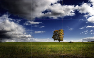
This photo uses the Rule of Thirds because the main image (the closer tree on the left) is positioned far off to the left. This helps to interest people, as it makes the photo more interesting. A tree in the centre of a shot will not be very interesting. It is even more interesting because the horizon also uses Rule of Thirds.


(Above: An image from the internet which uses the Rule of Thirds. Right: The same image, but with a Rule of Thirds box which i added over the top in Photoshop, to make it easier to understand)


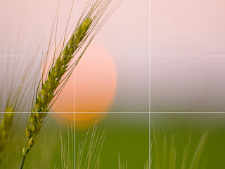
This is another image which uses Rule of Thirds. I particularly like this photograph because it uses it is two different places. Firstly, the main piece of grass on the left, swaying to the centre, but also the tops of other pieces of grass at the bottom, and the horizon is near the lower horizontal third. This is a very interesting photograph because of the way it uses the Rule of Thirds in multiple ways. I like the lighting as it brings out all of the detail in the grass. I also like the simplicity, as it is just a piece of grass.


(Above: An image from the internet. Right: The same image but with a Rule of Thirds diagram over the top, added in Photoshop)


Like the other photos, this also uses Rule of Thirds in More than one way. I believe that three ways have been used, the tree, the horizon and the left cloud grouping. Because of this, it helps to increase the interest in the photograph. The lighting is also good in this photograph as there is more vibrant colours around the main image, which is a tree.


(Above: An image from the internet. Right: The same image but with a Rule of Thirds diagram over the top, added in Photoshop)


I think that this is a unique photograph because of the way that it uses Rule of Thirds. I appears that it uses it four times, once for each of the thorns, and another for the branch or stem. This makes the photograph very interesting and unique. It also has good lighting as the black and white helps to interest me.


(Above: An image from the internet. Right: The same image but with a Rule of Thirds diagram over the top, added in Photoshop)


Canted Angle /Dutch Angle
 The canted angle is a Photography technique when the photograph is taken on an angle to create more of an interesting and effective photograph. I like this technique and I may use it in some of my themes in this photography project. Here is an example of some Canted Angle Photography which I sourced from the internet:

Close Up Photography
Close up photography is the technique of being very close to an object whilst taking the photograph. They very often include great amounts of detail and taken on a 'macro' setting which specializes in close ups. Here are some examples of Close up photography:


What makes a Photograph interesting?


Below are the 5 main topics which I think make a Photograph interesting.

Simplicity

When looking or taking a photograph, it could be useful to think about the simplicity of the photograph. Simple photographs are very often more interesting and more effective than photos with an action shot for example. If the photo has a very busy and cluttered background, it can sometimes be best to have a simple background instead. This is so that the viewer or audience focus on what the photograph is for or the purpose, like a portrait. If the photograph is of a flower in a field then, it is important to focus on that one flower. If you did not focus on the one alone flower, then the background is cluttered and filled with other objects, which will catch the audience’s attention, thus not paying attention to the main image. This can make the photograph very interesting to the audience or viewer.


Composition

The composition means the arrangement of the objects, or where they are situated in the photographic frame. This can be very important when creating a photograph, as it can be used to entice or to bring in the interest of the viewer or audience. If you are taking a picture of a building then take in mind that these buildings may be symmetrical (Or close enough) which is a good effect. So I think that symmetrical objects look good if it was in the centre of the photograph. But when taking other photographs like of nature, or a flower for example. Then it may be best to fit the main object on the left or to the right of the photograph. Depending on the angle of the object in focus. (Rule of Thirds). This certainly makes me interested in a photograph which uses a good composition. It makes the photo look more modernized and exciting.

Lighting

This is another extremely important element in the creating of a good photograph. I think this is important, as it is light, which allows us to see what is in the photograph. In order to create a good quality photograph, you will need a good quality light source, doesn’t matter if it is natural or artificial light. The light can help to give a focus on a particular part of an image of photograph, and can help to give a dynamic sense to any photo. But sometimes it may be good to include a contrast between the light and dark light sources. So like a bright and vibrant field, with a dark and cloudy sky. Or a city in the night, the bright street and city lights, against such a dark element. This can entice and interest the viewer or audience, as the lighting gives the photo its own unique and interesting personality.

Shot size

This is not necessarily the size of the photograph, but it is the size of the main object of the photograph. For example, if you are taking a photograph of a Rabbit, how close up will you have the main image, which is the Rabbit. Will it be quite small, in order to fit other objects into the scene, or larger so that the Rabbit takes up the majority of the photograph size. This can depend on the situation. If there is a good background, like a sunset then maybe a smaller shot size may be in order so that the Rabbit and the sunset work together. But if you want to focus in on the expression on the creatures face, like eating for example, then a close up will be far more effective. This helps to give the photo a personal and unique appearance, as the different shot sizes can entice the viewers into looking further into the photograph.

The main focal point

Once you have decided on what you want your viewer’s eyes to be drawn towards then it can be a very appealing idea to focus the camera onto a specific point in the image. If you are taking a photograph of a flower in the foreground, overlooking a field, with a sunset. Then to draw the audience away from the background, and to focus upon the flower itself. It could be a good idea to maybe focus of the petals, in order to preserve the beauty of the flower. By focusing on the flower, it will blur out the background, which will yet again get the audience or viewers’ attention on the flower, and not the background. This method crosses over with the ‘simplicity’ importance in a photograph. Macro can be good for getting good quality close up’s and focal points in a photograph. I believe that this can be a very important factor when trying to create an interesting photo as the detail in the main focal point can be very appealing to the eye.

A Photograph which I find interesting:


 I find this photograph interesting because it uses many of the factors and techniques that I have talked about. To start, it is quite a simple photograph, as it is a field, but the photographer has obviously used many other factors to make this flower scene look far more interesting. The composition is good in this photo because the main subject, (which is the collection of flowers and grasses close up on the right section of the photo) is not centre. Here the Rule of Thirds has been used to give the photo a more interesting appearance. The light source is from the upper right of the scene, most probably sun rise or sunset. (Given the angle from the shadows) The Sun rise or set gives off more of an orange glow than the normal sun. This shows that the photographer has thought about the lighting, and the light is in a perfect spot. It shows structure in the photograph. The main image in the photograph is easily visible, because of the size of the flower. This is a very interesting photograph.


Friday 8 February 2013

How to save Photographs from a Camera to an Apple Mac


1.     First take the SD card out of the camera.

2.     The Apple Mac’s have an SD card slot, which is located on the right side of the computer, underneath the CD slot. Simply turn the SD card the correct way, and insert it into the Mac SD slot.

3.     Then on the desktop of the Mac, there will be a SD card symbol appear.

4.     Double click on it and a menu file will open. It will include all of the different Photographs, which are present on the SD card. (The photos may be in some sub folders within the SD card)

5.     Then I will move the necessary photos into the ‘Pictures’ folder on the Mac. But first I will create a dedicated folder, which will contain all of the photos for this project. Then different sub folders for the different themes in the project.

6.     To move the photos from the SD card to the folder, simply, highlight the required photos, and then drag and drop them into the designated and appropriate folder, and sub folder.

7.     The photos are now ready to be further used, to edit etc.